

Transparency, when used in design, creates a visual ambiguity or equivocal space. When looking at a transparent design, it can be unclear which form is on top and which behind. Since photography accurately depicts spatial and depth representation, transparency is an interesting tool for an artist interested in visual patterns that do not immediately present a clear spatial organization.
Below are three examples of transparency taken my personal (late aughts) poster archive.

Charles S. Anderson Design, 2009, 4-color print
Layers on layers on layers in this great poster for French Paper.
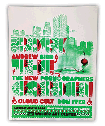
Burlesque of North Americam/, 2008, Screenprint
This Rock the Garden Poster uses fluorescent inks and equivocal space in a most playful way.

Aesthetic Apparatus, 2009, Screenprint
AA is making the most of a three color print. Blue and yellow make green.